|
1) Here are the five pieces of art work I chose for my collection: 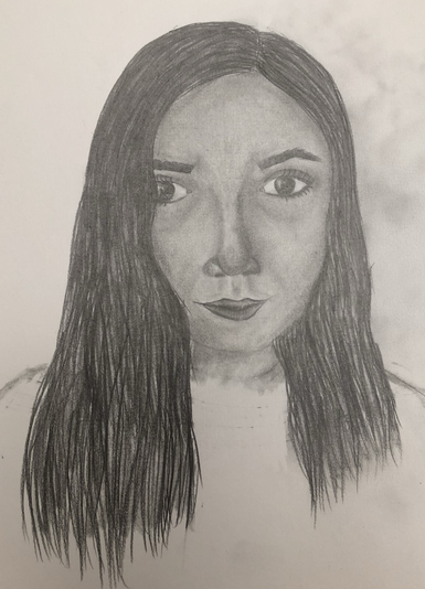 I chose this drawing for my collection because it shows a lot about what I learned in this class. One of the big things I learned in this class is how to draw people and more specifically the proportions of the face. This is a self portrait of myself and even though it doesn’t look exactly like me I’m still very proud of it. For this drawing I just used regular pencils and a blending tool. I spent a lot of time on this drawing shading the hair and skin to make it look more realistic and I think it does look quite realistic. After I drew this portrait I also drew some of my other friends in this class and I really enjoyed it.  I chose this drawing for my collection because I really like how bright and vibrant the colors look in it. I especially like how the yellow contrasts with the darker sky. Another reason I chose this drawing was because it was the first drawing I ever did with colored pencils where I wasn’t just coloring in lines like a coloring book. I took a long time to color in the sky but I think the gradient from dark to light blue turned out looking really nice. I learned a lot about how to use color and how to use colored pencils. For this drawing I used colored pencils on brown/tan paper. 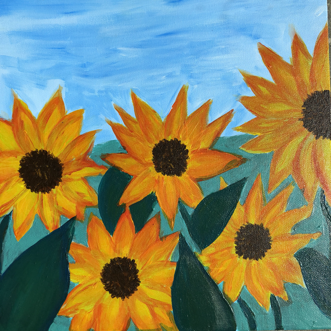 I chose this painting for my portfolio because I worked really hard on it and I like how it turned out. One big thing I learned this year was how to use acrylic paint and more specifically how to mix paint to make it whatever color you want it to be. Before this class whenever I would paint I would always just buy a ton of different colors of paint to use, but now I know more about how to mix paint to make any color I want. This painting was based on some pictures of sunflowers I found on the internet, I used different shades of yellow and orange to make the flowers really standout. For this painting I used acrylic paint on a canvas. 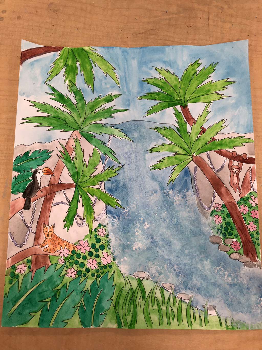 I chose this painting for my portfolio because it was one of the last pieces of artwork I made this year and it really shows what I learned in the class. I really like this painting because it’s intricate and has a lot going on. For this painting I used pen and then water color. I also used a sponge to make the waterfall look more realistic. 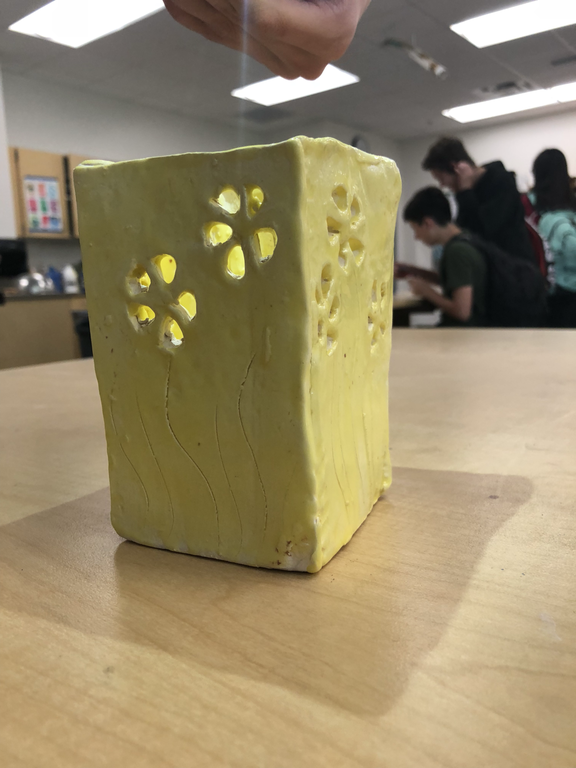 The last piece of artwork I chose was my clay pot. I chose this because I worked really hard on it and it was pretty difficult for me, because it kept falling apart. In the end I think ended up looking pretty nice. 2) Out of all of my artworks I’m most proud of my self portrait drawing. I’m most proud of it because it really shows what I learned about the proportions of the face. Before whenever I drew a person it either looked like and alien or a cartoon character so I think it really shows improvement. I also worked really hard on it and spent a lot of time on it. I also enjoyed working on the drawing because it was the first time I really drew people realistically and I thought it was pretty cool. Overall I’m really proud of this piece of art and really like how it looks. 3) Here is my final piece of artwork(above) compared to my earlier piece(below) 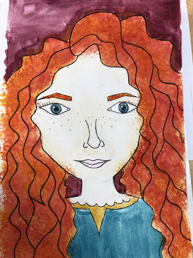 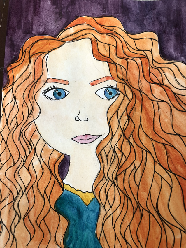 For my final art project I decided to recreate my watercolor painting of Merida. I wanted to recreate and make it more original because for the first one I basically copied it from a cool picture I found on Pinterest. I also wanted to change it to make it a more realistic version of Merida. To plan my painting I made a pinterest board to help find some inspiration, then i made three sketches of different ideas and to help me get the proportions correct. Then I started my final piece. Another reason I wanted to recreate this painting because I have learned a lot of thing about how to draw people which I could apply to painting. Compared to my first drawing where her face was weirdly round, her eyes were too big, and her nose as almost nonexistent, I think my new painting looks a lot more realistic even for a Disney character. I also learned a lot more water color techniques after i made the first painting. One of those techniques was using a sponge. I did this to Merida's hair on my second painting. I think it made the hair a lot more interesting and made it look more curly. Another thing I did differently on my new painting is that i actually shaded Merida’s face instead of just leaving it all one color like in the original( you can’t see this well in the picture). It was difficult with watercolor to make the right skin tone because Merida is very pale so I had to add a lot of water. 4) I really enjoyed being in this class this semester. One thing I really liked about it is that it was really open, you could choose what you wanted to work on and there weren't any strict guidelines for the art you could make. I also liked that we had times where we could work on what type of art that we wanted, and I have lots of interesting pieces of art that aren't from a specific project. Some of my favorite projects that we did are tie dye, and acrylic paint. One thing I would change is that we would spend less time on drawing so we could get to explore other types of art more like watercolor.
0 Comments
 for my enviorment project I decided to draw a rainforest environment for this project I usedwater color and pen. I wanted to do a rainforest because it’s a very intricate enviorment with lots of different t creatures living together. I started by outlining my drawing with pen and then I watercolor it. Also Gentry told me to use a sponge while painting the water fall and I think it made it look very realistic. I really enjoyed making this piece of art because it was like a paint by numbers.
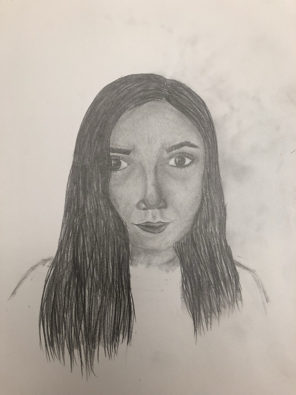 This week in art I learned how to draw faces yah Frye correct proportions. This was my learning project. I used Pinterest to find the correct proportions of a face and then I used a picture of myself to draw. I really enjoyed drawing faces because you got to make something that looks very realistic.
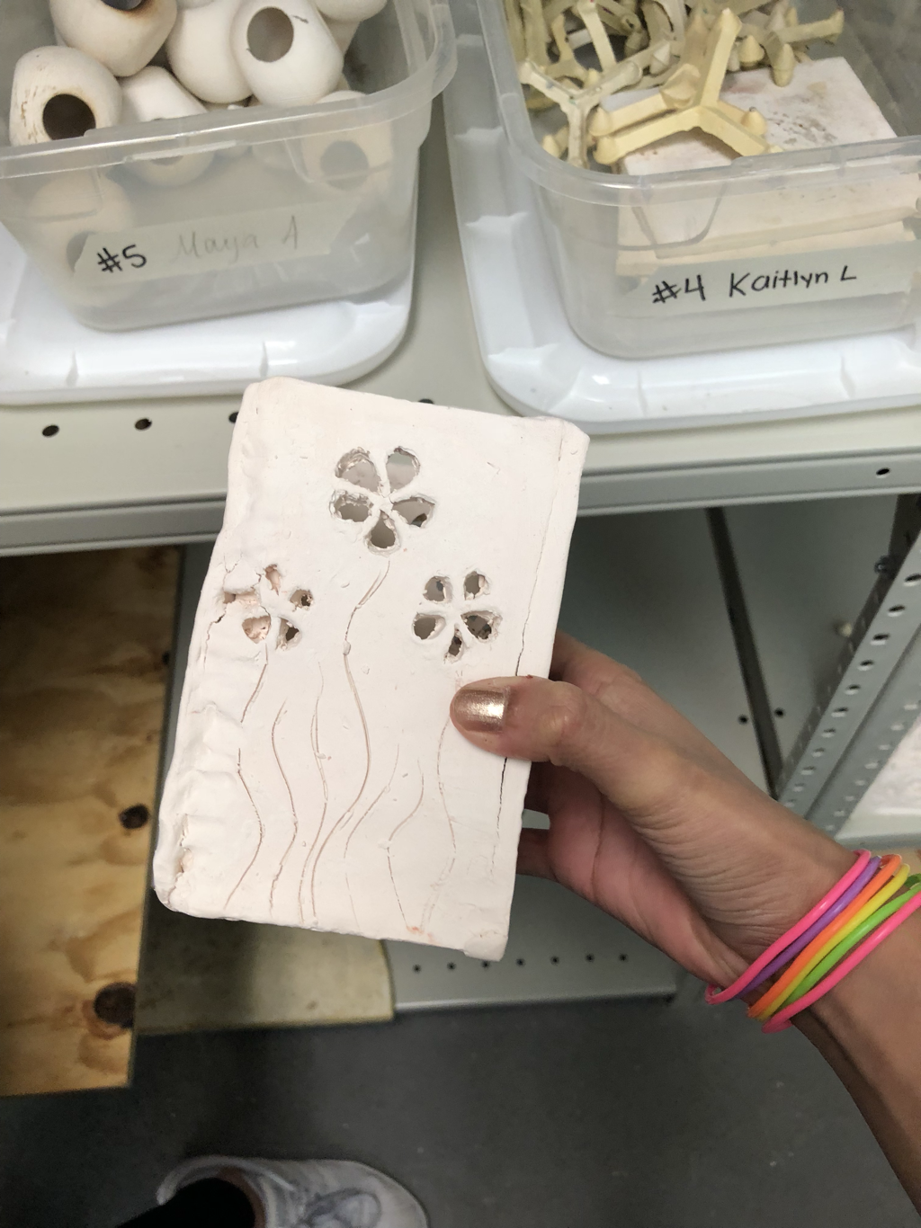 This week I worked in my clay box. I learned a lot about clay like how you need to scratch and stick it using slip when you are joining to pieces together. For my clay box I made 5 rectangles out of slabs and then I used one of the clay tools to cut out flower shapes. When it was leather hard I joined them together. Working with clay was really interesting.
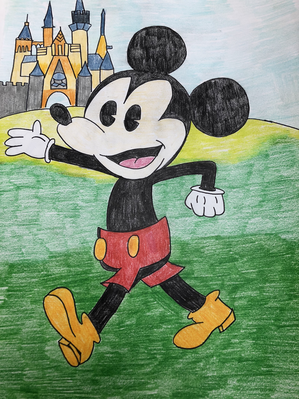 For my visual biography I decided to draw Mickey Mouse with the Disney castle behind him. This represents Walt Disney because it’s 2 of his biggest or most most famous symbols. I used colored pencils to make the colors bright to fit the happy theme that Disney has.
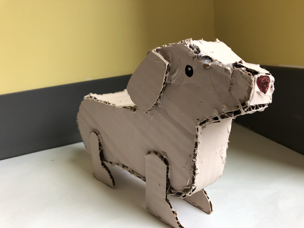 For my cardboard sculpture i maDe a cardboard dog named fred. I started by makikg 2 bases And then adding a piece in between them. Then i painted it and Added deTails. Working with cardboard was difficult but fun.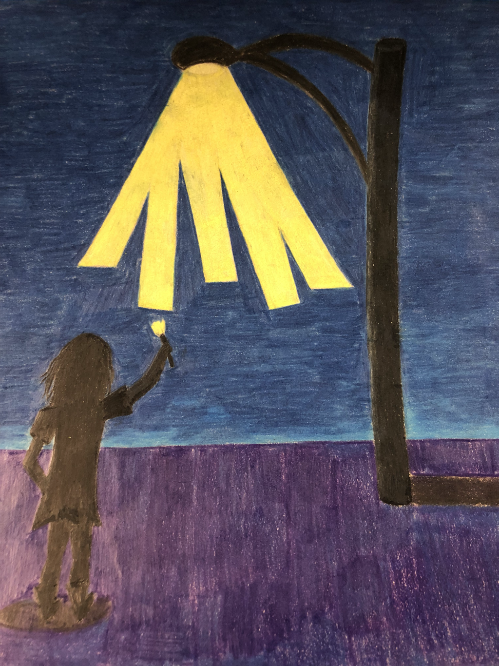 For my optical illusion drawing I drew a girl painting the light, this was inspired by a picture I saw on pintrest. I used colored pencil with brown paper so that the colors would be very bright. I also used contrasting colors like yellow and purple so that the light would seem brighter.
For my acrylic painting I decided to paint some sunflowers. I started by painting a sky blue base and then layering in the leaves and sunflowers. I learned to use different shades of colors to make an object to look more realistic and to give it texture. I did this in the sunflower by using a combination of warm and cool colors. I also found out that you have to use several layers of paint to make a light color like yellow completely opaque. 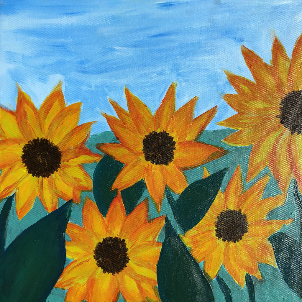 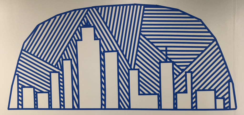 My group and I created a tape mural of this city inside a dome, it was inspired by a post on Pinterest. We changed it up by adding the dome and changing the buildings. Working in a group is nice because you get to hear a lot of ideas and you a also get things done faster. One challenge that we faced was that we had trouble making all of the lines straight, but we worked patiently and figured it out.
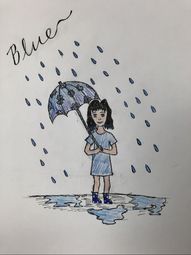 For my drawing for the word of the week "blue" I decided to draw a girl in the rain who looks blue. I used different values of blue to represent the word.
|
