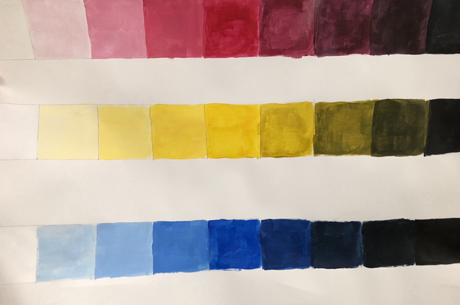
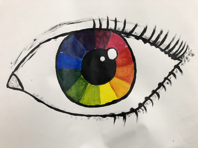
Color Wheel and Value Charts
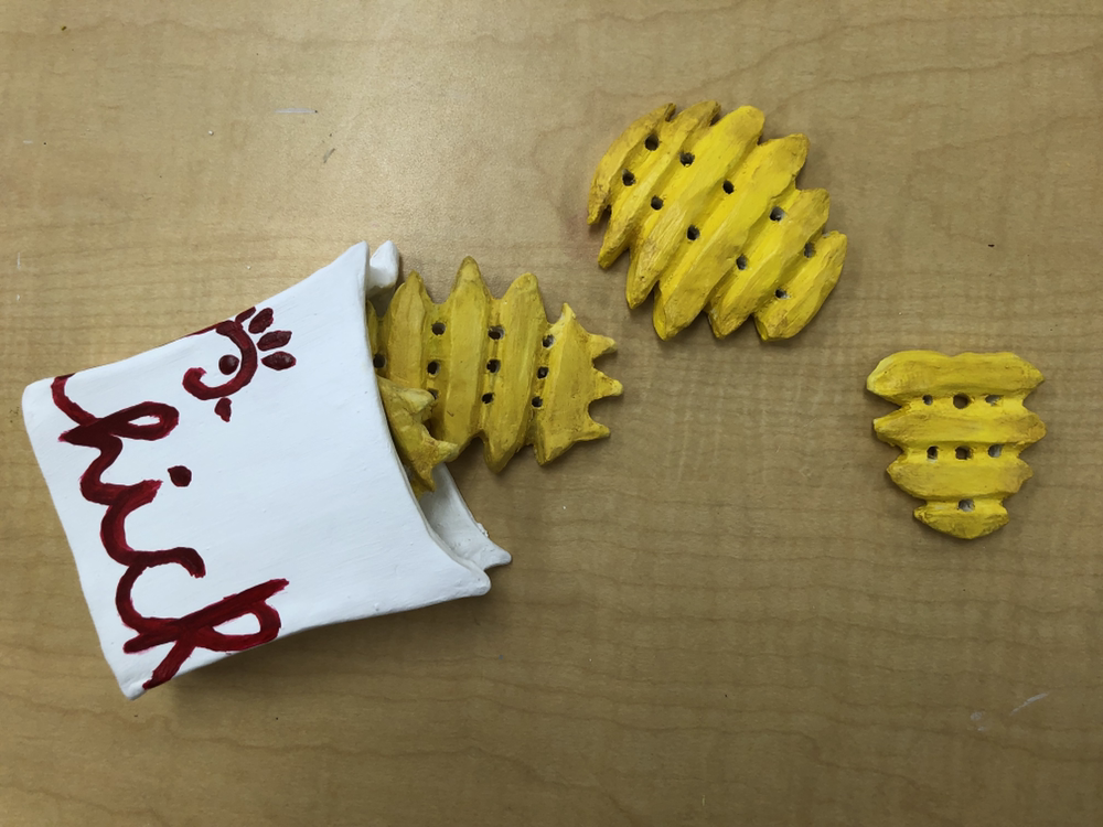
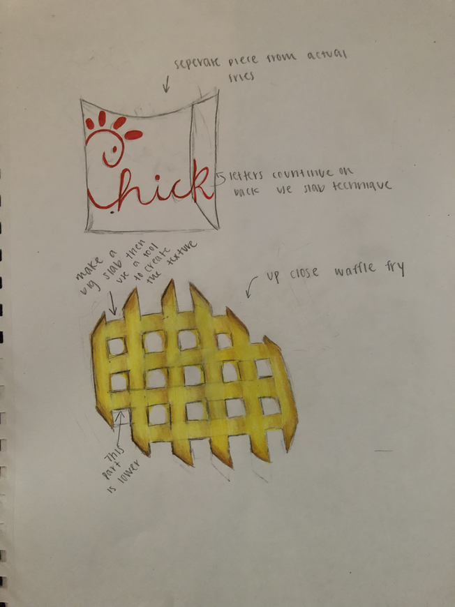
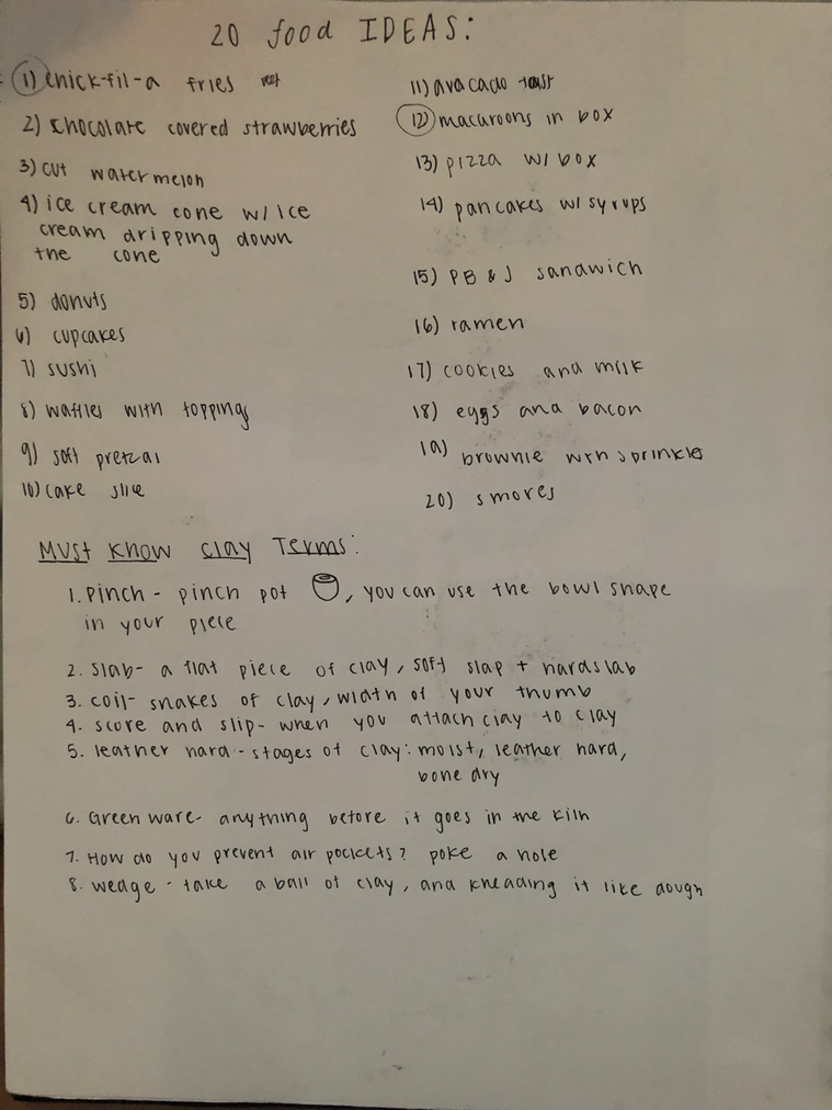
Clay Food
Critique Questions:
1. I think the craftsmanship of my clay is pretty good overall. The clay is smooth and well structured. I think the texture of the fries is nice and makes them look more realistic.
2. The most difficult part of this project was making the fries because they kept falling apart because they were to thin and it was difficult to carve out the small holes in them. It was also very difficult to make the fries realistic.
3. I think my color choices worked to get her well the yellow wasn’t exactly accurate but I think it looks good with the red of the Chick-fil-A logo.
4. I think my sculpture is interesting from most angles, but if you are looking at it directly from the back it isn't very interesting. I think individually the fries are interesting from every angle.
5.The difference in doing sculpture is that you have to look at your piece from all sides and angle , also with sculpture you have a chance to make something very realistic.
6. I created texture using the clay tools. I created the texture in the fries by cutting pieces of clay away and carving out the small holes. On the container for the fries in used a sponge to make it completely smooth because it doesn't have any texture.
7. I think the sculpture looks very similar to real fries, it is not exactly the same but I think it is the best I could have made it. I accomplished this by using texture and making sure to look off my reference images.
8. If I were to do this project again I would have added more details to the fries because I think I could have done more. Also I would have planned it out more so I would have been more efficient with my time. Also I would have made the fries thicker so they would be easier to carve into.
In-Progress Photos:


Reference images:

Color sketch:
These are my 20 ideas.
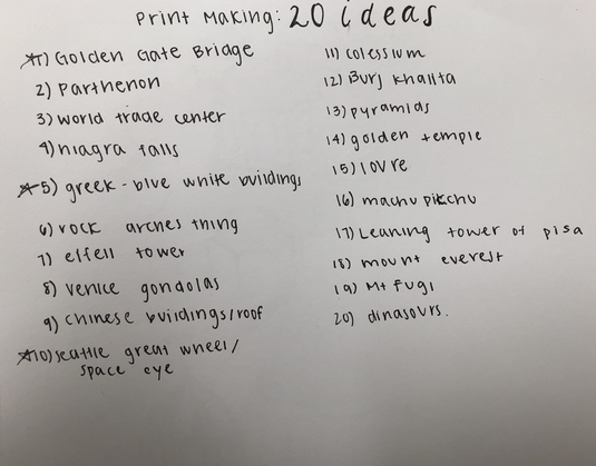
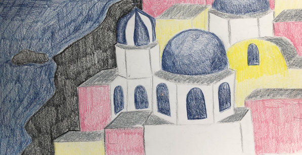
Print Making
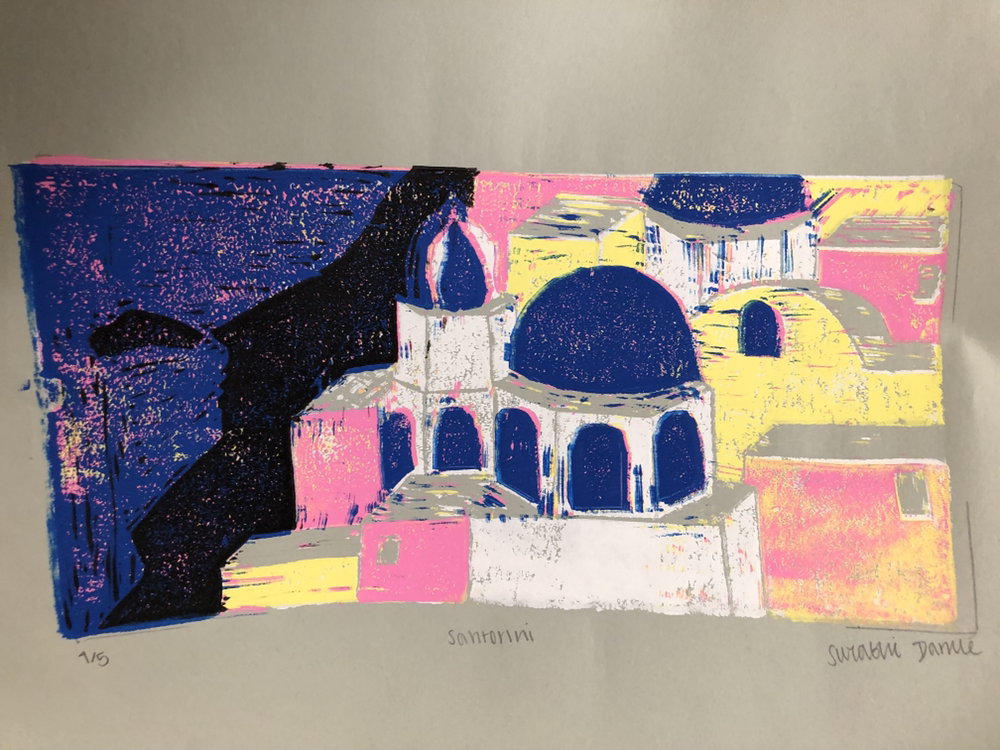
For my print making I was inspired by the blue and white buildings of Santorini, Greece.
In progress pictures:
In progress pictures:


Final:
Critique questions:
1) I think the idea and composition of my print is good, but execution of it isn't very good. I think the craftsmanship is okay, and I really like the colors I chose.
2)I think the texture the printmaking created gave the buildings an interesting look, it wasn't exactly intentional, but I look how it made the buildings look. I think the color harmony really adds a lot to the final print, i think it adds to the greek beachy look that Santorini has in real life.
3)If I could recreate my piece I would be very careful when printing the different colors, also I would carve deeper into linoleum so that I wouldn't have all of those small marks of different colors.
20 ideas:
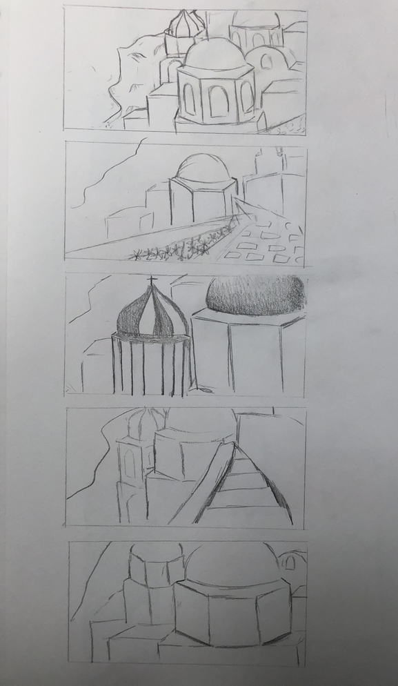
Compositional sketches:
Color sketches:
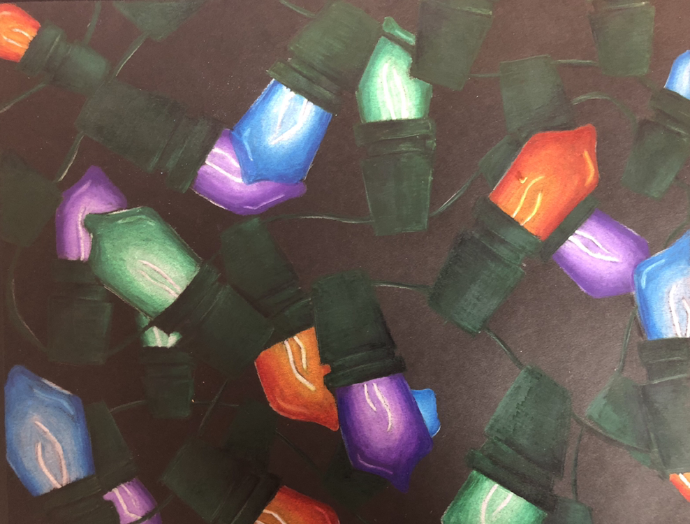
Christmas Lights Final
In progress pictures:


Final:
Critique Questions:
1) I like the composition I created even though it is simple. I think the colors of the lights ad unity to the picture, and I like the amount of positive and negative space.
2) I used value in the drawing to show the brightness of the lights, I also used value in the wires to make it stand out against the black background.
3) I think the exaggerated color makes the lights look brighter and more realistic. The color makes it really stand out against the black background.
4) I think my project is pretty well crafted. The quality is okay. The details in the lights were challenging to do, but I think it adds a lot to the craftsmanship.
5)I don't think I achieved very much depth in my drawing because they're really is not a background. There is some depth that you can see in the overlapping lights.
6) I enjoyed working with chalk pastel, color pencil, and watercolor, I did face some challenges blending with the prismacolors in my christmas light drawing. I think because it was so bright it was harader to blend, it took a long time to blend, but in the end I think it looks okay.
Candies Watercolor
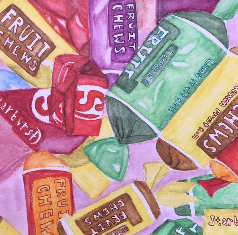
This is my final watercolor piece of the candy. The water color was a little difficult to work with at first but I ended up liking how it turned out.
Watercolor Final
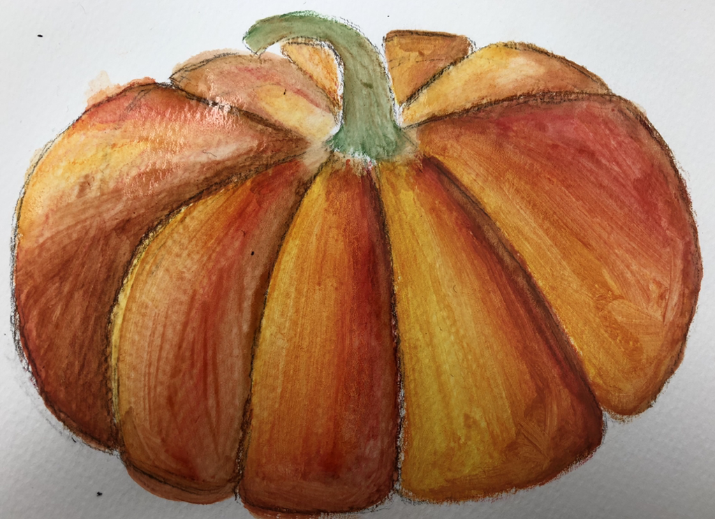
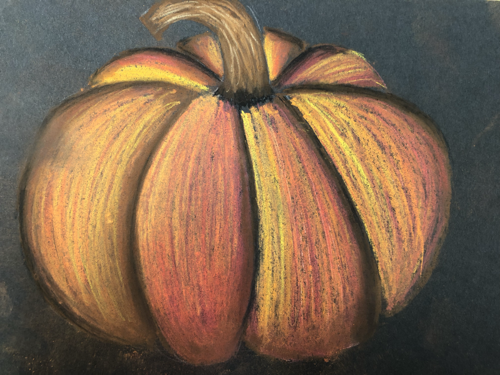
This is my final water color pumpkin. Watercolor is my favorite out of the three.
Watercolor practice


These are my practice sphere and come using watercolor.
Pastel Final
This my pastel final I think it turned out good
Pastel Practice


These are my practice shapes for pastel. They aren’t the best but it was one of the first times I used pastel pencils.
Color Pencil Final
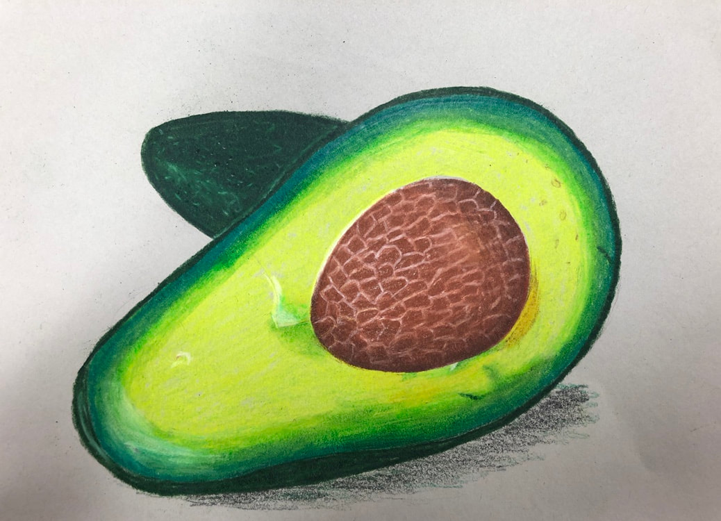
For my final colored pencil drawing I drew an avocado.
Color Pencil Practice


These are my practice colored pencil drawings.
Final Pen Drawing
In progress pictures and sketch:


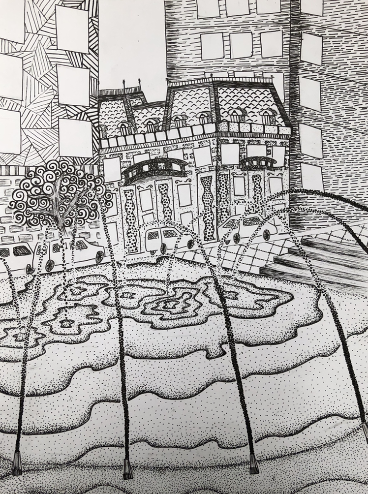
Final Drawing:
Reflection
1) I arranged my composition by cropping the picture I took in different ways to see which one looked the best. I used value and contrast in my final piece to make the different objects stand apart in the page. I also used texture in the water and on the buildings to make it look more realistic . Overall I think it was a good composition.
2) Texture and pattern are very important in my drawing because they ad depth and make the different layers of objects stand out.
3) Value is so important in this project because the different values make the objects stand apart. If all the patterns had the same value then everything would blend together.
4) I think I did a good job on my craftsmanship in this project I added lots of details especially on the building in the middle. The details to a long time but I think I ended up with a pretty good project.
5) The practice we did before this project helped a lot with the final project. The practices taught me how to add value into a pattern and how I could make a pattern look lighter or darker this helped me with the buildings in my final piece.
6)It’s important to understand the different concepts we learned in class so you can apply them to your final project so that it turns out the best it can. The concepts we learned in class helped me on my final even though it was slightly boring to be practicing for so long.
7)As a growing artist this project has taught me a lot of new techniques that I could use in my future work. It also taught me how to be more patient with my art work because the stippling and details on the project take a lot of time.
8)If I could recreate my piece in anyway I would spend more time on the details in the other two buildings besides the one in the middle I think by the time I got to this part of the project I was bored so I slightly rushed it.
20 Ideas
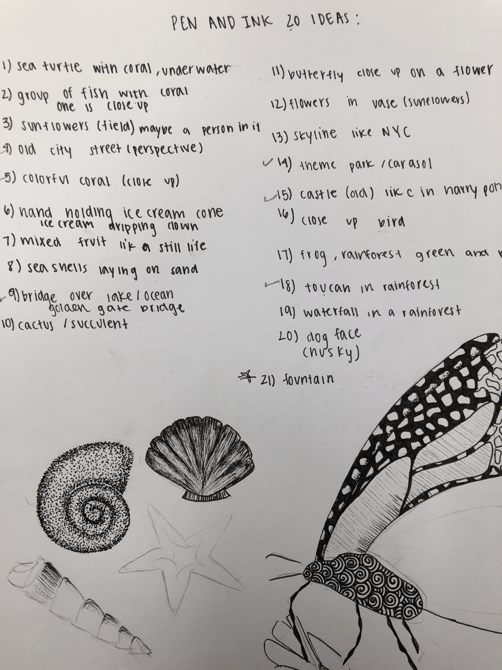
These are my 20 ideas. I ended up doing the fountain.
Landscape Drawing
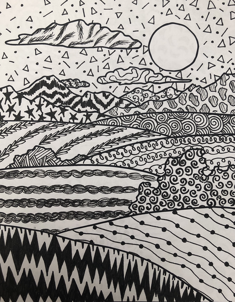
This is my landscape drawing with textures and patterns.
100 Pattern Ideas
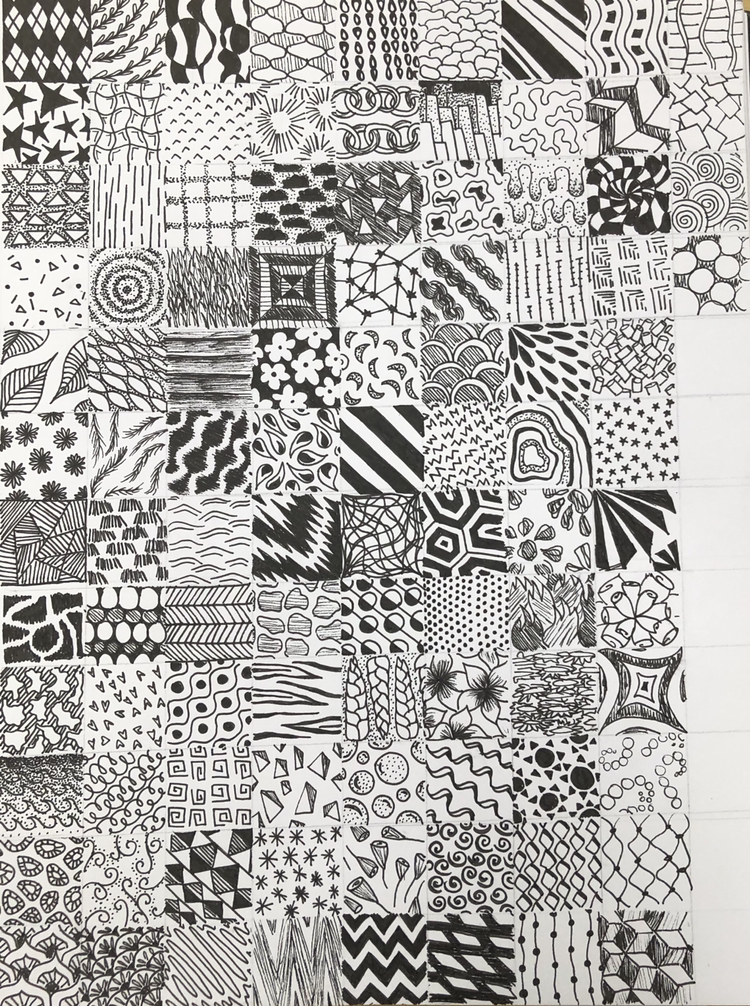
These are my 100 different ideas. This took me a lot of time but I think that I have some interesting patterns.
Texture Video Drawings
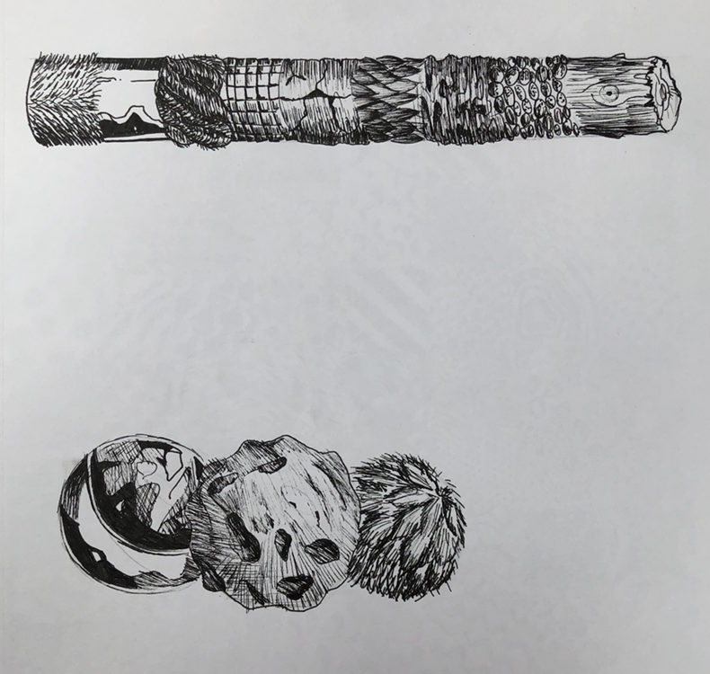
These are my textures spheres and cylinder that I copied of the video
Texture Worksheets


These are my texture worksheets where I copied different textures.
Pen shape drawings


These are my practice forms with different techniques like stippling and hatching.
Stippiling Worksheet
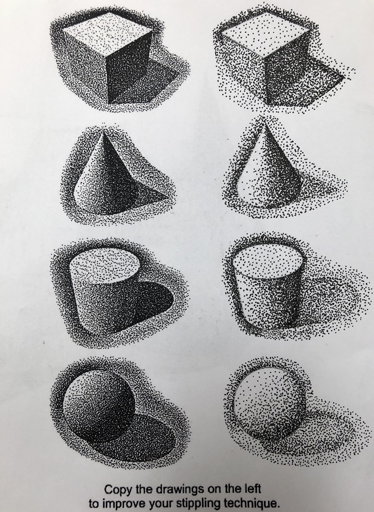
These are my stippling practice forms. They took a very long but I think they turned out well.
Pen and ink value chart
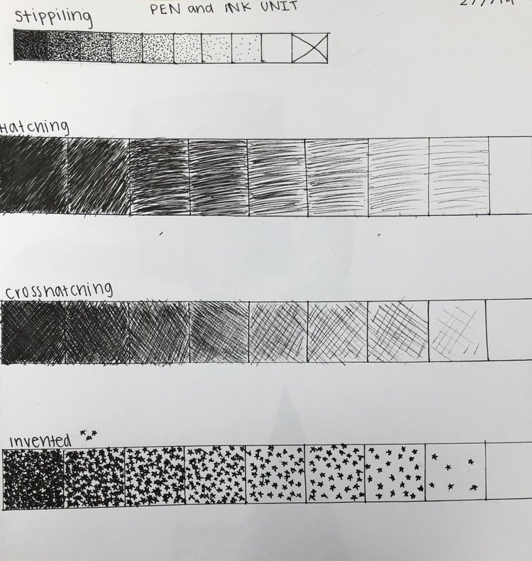
These are my 4 value charts for my inventive one I did little stars.
Pencil Still Life


- Describe how you arranged your composition. Discuss your use of the elements and principles. Is it a successful composition? I arranged my composition by looking at the objects in a view finder. I choose my final composition out of the five drawings I did because I liked how you could see many objects in the composition, and I liked how you could see the reflection of the star pinwheel in the shadows. I think it is a successful composition. I used the elements texture and value through out the composition. I used value to show the position of the objects in regard to each other like how the mason jar is in front of the tissue box. I used texture to show how the object feels like the ball has holes in it and the glass is shiny, which you can see in my drawing.
- Did you use a wide range of values? (A range from white to black with at least 9 values). Explain how is this evident? Explain how your knowledge and creating practice studies with value contributed to your piece. I did use a wide range of values in the my drawing you can see how the label of the paint bottle is way darker the the bottle's cap. My knowledge/practicing of value helped me on this project because it helped me make the objects look more realistic. Through practice I learned how to make objects stand out with value instead of using a line around them.
- Describe the blending and transitions in your objects (discuss your use of pressure with pencil and other techniques to achieve this). I think the blending an transitions in my drawing are relatively good, but you can still see some pencil lines in some spots, what helped me with transitions and blending in my piece was to use a lighter pencil and to go slowly so that the transition of colors would be smooth and not choppy.
- Explain how your interpretation of texture is essential in capturing the look of the object. Texture is important in capturing hoe an object looks because it is what makes the object look realistic in a drawing, also the value of a object depends on the texture the bumpy ball in my drawing wouldn't have the same values if it were smooth.
- If you could recreate your pieces what would you do differently to enhance the final outcome? If I could recreate this piece with more time I would defiantly go much slower with my shading and transitions to make them look more smooth. I would also spend more time on the shadows of the objects.
Color pencil and Pencil Shape Drawings


here are my two pencil shape groupings, I didn’t have time to completely finish the color pencil one .
Assesment Drawings


These are my first four drawings from art 2. For my animal drawing I decided to draw a dog, I used shading on the fur to make the dog look more realistic. I also added a dog collar and leash to make it look like a dog out on a walk in their natural environment. For my tree scene I drew two trees, I added details in the leaves and grass to make it look more realistic. The third drawing, the hand, was the most difficult for me to draw. I chose to draw my hand holding a pencil. To help me draw this i took a picture of my hand and used it as a reference. The last drawing is the street drawing. I don't know to much about one point or two point perspective so I decided to draw what I though it should look like. I added details in the windows to make it look more interesting.
Pencil Shape Drawing


These are my four shapes that I drew. For all of them I used shading to make them look more three dimensional. To shade them I made sure to know where the light source was coming from, so then I could know where the lights and darks are. Out of all four of them I thought the cube was the most challenging because it was difficult to shade it without it looking flat and unrealistic.
